

A month into designing my tabletop role-playing game supplement, I realized I would have to design it twice: once for maximalism and once for accessibility. Although it would have the same core information—campaigns for role-playing sessions, framing information to help the game master, and random tables to generate loot or improvisational monsters—the way that information was presented should radically change.
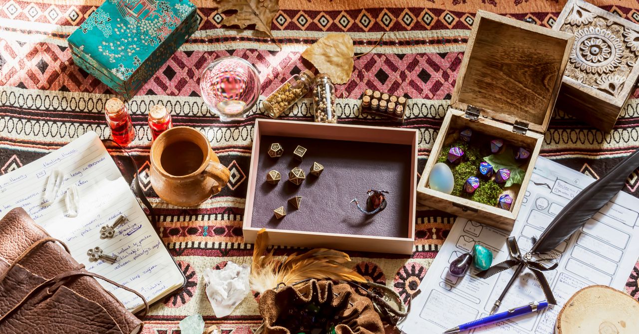
Since TTRPGs are centered in the players’ imagination and decision-making around the table, there’s frequently much less equipment or paraphernalia than in other games—sometimes just a pen, paper, and a book to explain the rules to games like Shadowrun, Blades in the Dark, or Dungeons & Dragons. Rule books act as tomes, bibles to understand the game’s setting, goals, and order of play. Written supplements act as expansions or additional missions to venture on. They’re cracked open frequently to prepare for an intense game, and again during it, and many are wonderfully laid out for ease of reading, such as those for Mothership and Wanderhome.
Many of today’s TTRPG designers create both the writing and layout for a role-playing rule book digitally. This gives them more power than ever to create unique rule books—with a suite of tools or goodies to draw from, including map generators, paper texture packs, and nearly illegible medieval fonts.
But when you continually layer art and text, pages can get overwhelming and difficult to parse for experienced tabletop gamers—much less gamers with barriers to entry, such as new players or those with disabilities. Are the fonts dyslexia-friendly? Can an audiobook version be released alongside the game? Is all text tagged for those who use screen readers, like people with sight difficulties? Accessible design is good design. As TTRPG rule books become more experimental and artistic, there is a legion of designers, consultants, and playtesters fighting for good design, not of fantastical worlds or campaigns, but of the pages those stories are printed on.
TTRPGs Should Take Place in Labyrinthian Dungeons, Not Look Like ThemA TTRPG rule book can be designed with accessibility in mind in every aspect. It’s more than just selecting a good font. If text is spaced too tightly, the density of characters and lines can make it hard to track your progress in-line or on the page—it’s tough to identify a tree when overwhelmed by a forest. Formatting columns incorrectly can make screen readers read the text in the wrong order, a problem a sighted person could overlook during layout.
More From Pearse home runFans Rally Around Blaseball, America’s Favorite SplortPearse Anderson
 mount upWe Asked Giant-Robot Experts to Critique Video Game MechaPearse Anderson
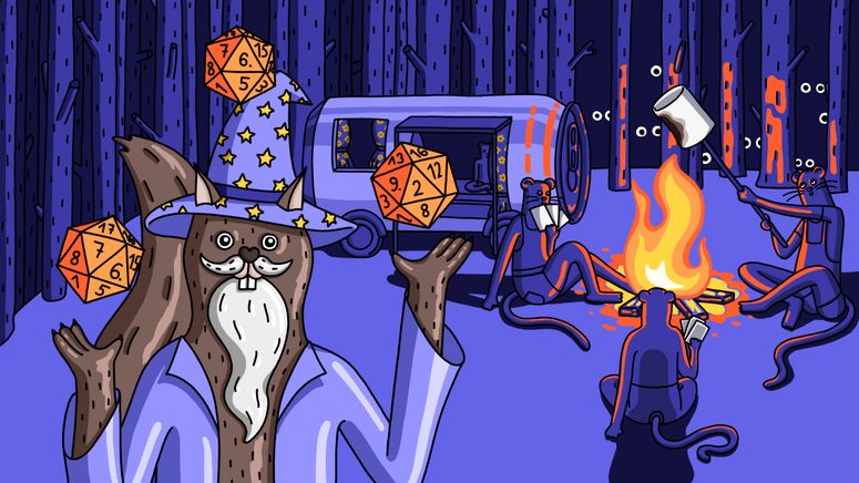 tiny vibesTeeny-Tiny Talking Mice Have Taken Over GamesPearse Anderson
Because there are so many types of colorblindness, important colored sections of rule books should be notated in a secondary way: Differently colored player tokens, for example, could vary in texture or shape as well. Writer Adira Slattery has anomalous trichromacy, a red-green color blindness that makes it impossible to read rule books without enough color contrast, such as green text on a teal background. Her favorite games for colorblind accessibility include Dream Askew / Dream Apart, which uses colors in ways that don’t distract from the text, Lancer, which separates and orients text in a superbly clear way, and Beyond the Rift, which does have the harder-to-read white text on black backgrounds but includes buttons on digital editions to invert the entire rule book’s color scheme, perfect for Slattery.
For disabled designer and writer Basil Wright, looking at vivid images for more than a few seconds can cause a headache because of nearsightedness, leading them to question—does this image need to be in the rule book? Wright also points to the positioning of text. “I've looked at a few adventures where the writing will start at the top left corner but then take a circuitous path throughout the page, which can cause a lot of mental fatigue and increase the level of effort to comprehend the text.”
Labyrinthian layouts can be fun for players to explore on their own time, but can you imagine searching for a spell description mid-battle in a rule book that looks less like a mage manual and more like the bizarrely laid out nonlinear novel House of Leaves or the dense sermonic Dr. Bronner’s soap label?


Tabletop RPG rulebooks, more than just game guides; they are works of aesthetically pleasing design and staggeringly accessible narratives that immerse players into vividly described worlds.

The aesthetic appeal and user-friendly design of tabletop RPG rule books serve as inspiring gateways to a world full of imagination, elevating the gaming experience from merely functional tools into visually captivating works weaving together storytelling with systematic play.

The artful design and clear presentation of tabletop RPG rule books not only makes them aesthetically pleasing but also provides a user-friendly approach to enhance accessibility for gamers at all levels, fostering engagement with the shared narrative experience.

Tabletop RPG rulebooks are not merely a collection of pages but works of art, designed to be both aesthetically pleasing and seamlessly accessible for players at any experience level.

The visual elegance and intuitive layout of Tabletop RPG rule books not only signify their profound depth but also ensure accessibility for both seasoned players and newcomers, making the worlds they describe as vibrant while ensuring all can settle within them.

Tabletop RPG rulebooks are not just functional tools but also美学与便捷性的和谐统一, inviting players and game masters alike into vibrant worlds with their meticulously designed layouts and clearly presented mechanics.