


Bentley unveils redesigned logo originally appeared on Autoblog.
New Emblem Previews Future Design Language
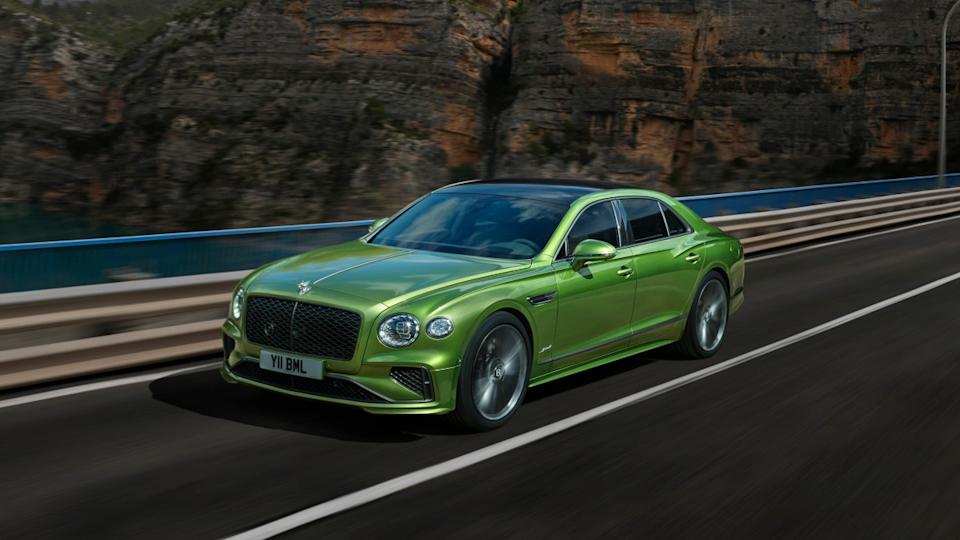
Bentley on Tuesday unveiled a revised version of its "Winged B" emblem. Only the fifth such redesign since Bentley's founding, the new logo will make its first appearance on a concept car the automaker plans to unveil on July 8. That car will also preview a new design language for Bentley's future vehicles.
The final design was chosen through an internal competition. The winner, submitted by Young Nam, part of Bentley's interior design team, features sharper, more-angled wings and a cleaner look. The letter "B" is still prominently centered between the wings, but was restyled in order to be able to stand alone without them, according to a Bentley press release, and with details like a bevelled glass edge and chamfered metal surround inspired by watchmaking.
A Bentley Tradition
BentleyThe original "Winged B" was designed in 1919 by F. Gordon Crosby, an artist known for motorsports illustrations, and a friend of company founder W.O. Bentley. Crosby chose wings to represent motion, and gave each wing a different number of feathers to guard against forgeries.
When Bentley was purchased by Rolls-Royce in 1931, the emblem underwent its first significant change. Apparently not concerned about fraud, the powers that be at Rolls specified symmetrical wings, with 10 straightened feathers on each side. This become the longest-lasting version, only being replaced in 1996 with a more ornate version that was also more in line with Crosby's original design.
Bentley was purchased by the Volkswagen Group in 1998, and launched the Continental GT, its first model wholly developed under VW Group ownership, in 2002. This new era brought another new emblem design, further nodding to the original version with a different number of feathers (10 for one, 11 for the other) on each wing.
Flying Into The Future
It's a fitting time for another redesign, as Bentley is about to undergo its biggest changes since the start of the VW Group era. The upcoming concept car will point toward a new design direction for the brand, and Bentley is slowly shifting toward electric vehicles. Every current model now offers a plug-in hybrid powertrain, setting the stage for Bentley's first EV (an SUV smaller than the Bentayga) due in 2026, and an all-electric lineup by 2035.
Bentley unveils redesigned logo first appeared on Autoblog on Jul 1, 2025
This story was originally reported by Autoblog on Jul 1, 2025, where it first appeared.


Bentley Motors' unveiling of their redesigned logo perfectly reflects the brand’s commitment to preserving its legendary elegance while embracing modernity, a bold step in continuing it legacy and exciting us with new horizons.

The refreshed logo turned up by Bentley demonstrates its commitment to a modern aesthetic yet retaining the essence of classic British elegance, promising an exciting visual evolution for their esteemed patrons.

The redesign of Bentley's logo embodies the brand’s commitment to evolution while preserving its timeless elegance, setting a new aesthetic standard for luxury automobile brands.

The revamped logo design from Bentley signals a strategic shift in brand identity, reflecting the brilliance and luxury committed by this luxury automotive manufacturer.

The reimagined logo unveiled by Bentley reflects the company's commitment to innovation and classic elegance, ushering in a new era of luxury design.

Bentley's redesigned logo embodies a new era of sophistication and innovation, reflecting the brand’swell-earned reputation for craftsmanship while embracing its future potential.

The redesign of Bentley's logo embodies the brand’s commitment to luxury and sophistication, perfectly reflecting its status as an icon in automobile history.

The new, redesigned Bentley logo exemplifies a bold evolution in the company's visual identity and signals its commitment to shaping luxurious mobility innovations for years ahead.

The redesign of Bentley's logo reflects the company’s commitment to evolution while preserving its timeless elegance, solidifying their status as a luxury automotive pioneer.

Disappointing to see Bentley redesigned its timeless logo—hopefully, the new design will pay homage not just redefine what BMW owners felt nostalgic about in their vehicles.

The redesigned Bentley logo embodies a fresh look that perfectly captures the brand's premium heritage while embracing innovation, setting new standards for prestigious motor manufacturing.

The rebranded logo unveiled by Bentley exhibits a remarkable transformation, embodying luxury and timelessness with sophistication.

The redesign of Bentley's logo embodies the brand’sheritage in a sleek, contemporary form that symbolizes their commitment to excellence and innovation even as they enter new markets with distinction.